


Essential for some, useful for all
It’s a common myth that web accessibility only benefits disabled people or people with sensory, cognitive or motor impairments. In reality, making your website accessible means it’s easier for everyone to use.
Different situations and environments affect how a person uses a website. Some people may be temporarily disabled, either through a broken arm or by cataracts, for example.
Others may be in an environment that affects the way they interact with your website. For example, someone using a phone screen outdoors in bright sunlight. Other may be using your website on the bus, or while they’re holding a baby or multi-tasking.
Web accessibility principles that benefit all users
Web accessibility helps people in a variety of situations. Here are a few examples of accessibility features and some of the users who benefit.
1. Colour combinations with good contrast
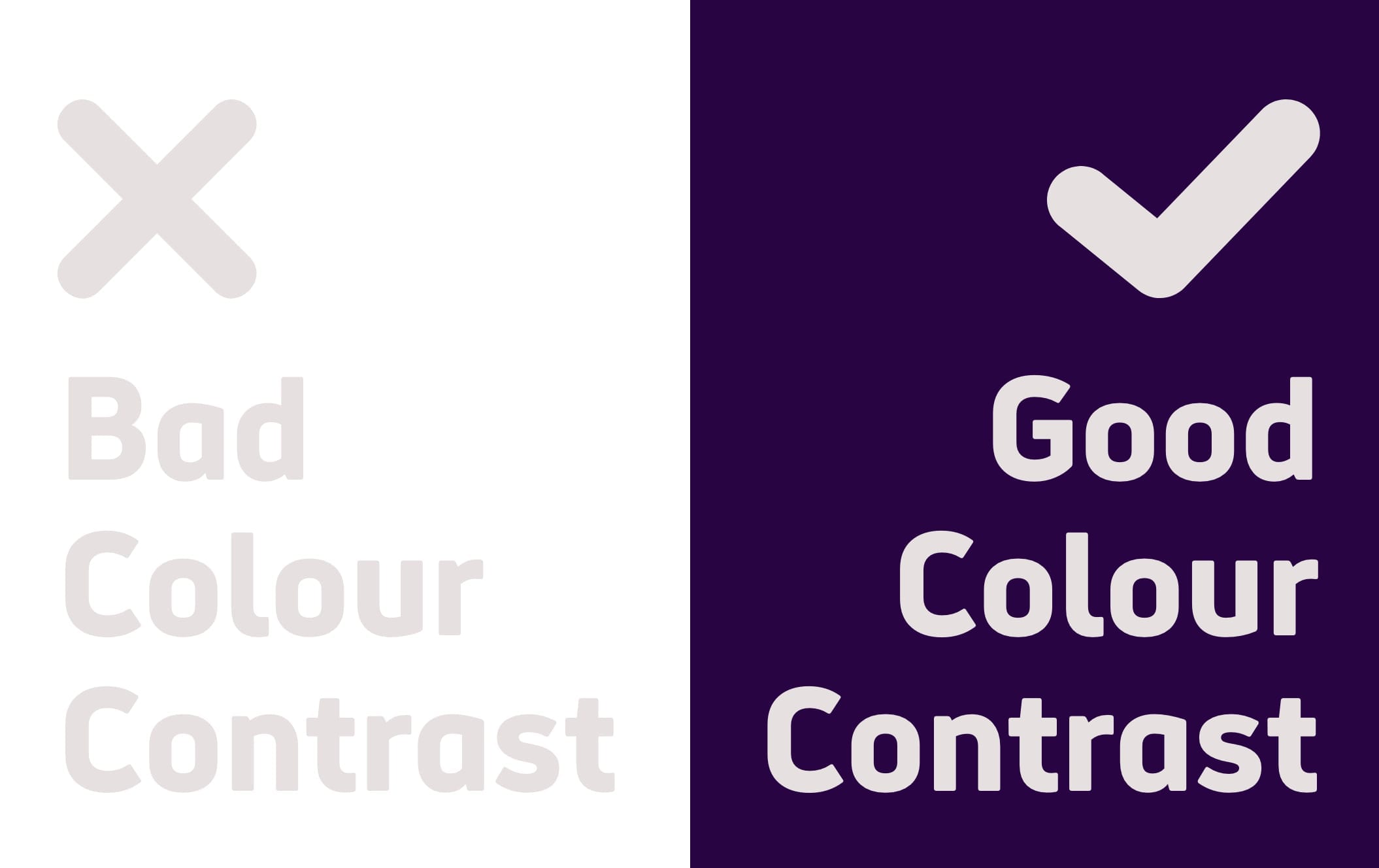
Websites should have a good colour contrast between text and background colour. That includes links, icons, buttons and any other information on the page.
An example of poor colour contrast is light grey text on a white background.
Essential for
- People with low vision or a visual impairment
- Certain people with colour deficiencies who may struggle to distinguish between certain colours.
Useful for
- Elderly people and anyone over the age of 50, as the colour contrast sensitivity in our eyes naturally declines with age.
- People with temporary disabilities, like cataracts
- People in different lighting conditions, for example, experiencing glare on a mobile phone screen in bright sunlight.
- Everyone, including those with non-specific visual conditions. That’s why the most popular, legible colour combination is dark text on a white background.
Note, people with dyslexia or migraine sensitivity may prefer lower colour contrasts. That’s why it’s important to let users change the contrast between background and text.
2. Writing in Plain English
The average reading age in the UK is 9 years old. Writing in clear, plain English is the best way to ensure your content reaches the largest number of people possible.
Fewer people will be able to understand dense text filled with complex language, acronyms and jargon. Metaphors and figures of speech can also be confusing for those who cannot understand the inferred meaning. Using plain English makes your writing easier for everybody to understand.
Essential for
- People with learning difficulties who may be unable to understand complex vocabulary and language
- People with a cognitive impairment who may struggle to focus on dense passages of text.
- People with autism who may take phrases and expressions literally.
- Deaf people who prefer British Sign Language (BSL), over English, as their first language.
- People with dyslexia
- People with chronic fatigue
- Users with lower literacy levels
Useful for
- Everyone, as most people prefer reading clear, simple language, even subject experts and scholars.
- People who use English as a second language
- People who are reading in a rush
3. Closed captions on videos

Closed captions describe all dialogue and sounds and in video audio. People often confuse subtitles with closed captions, but they are slightly different.
Closed captions provide a text alternative in the same way subtitles do, but they include other relevant sounds (like “Door knocks”) in the video.
Captions are a perfect example of an accessibility feature that helps a range of both disabled and non-disabled users.
Essential for
- Deaf people
- People who have a hearing impairment
- People with cognitive impairments or learning difficulties, who may use captions to help them understand video content.
Useful for
- Elderly people affected by hearing loss
- People with Attention Deficit Hyperactivity Disorder (ADHD), who may use captions to help them focus.
- Users who experience sensory overload or migraines, who may prefer to watch videos without sound.
- People with hearing loss
- People watching videos in a loud, public environment, like a bus. Or people watching in a silent environment, like a library.
- People who use English as a second language
4. Keyboard-only navigation
Making sure your website is set up for keyboard-only navigation is a fundamental accessibility principle.
It affects anyone who uses assistive technology, like a screen reader, to navigate through a website. This includes a large range of people with motor, sensory and or cognitive impairments.
Keyboard users typically use the tab key to navigate through elements on a web page such as links, buttons and forms.
Essential for
- People with motor impairments who rely on a keyboard, instead of a mouse, to navigate a web page.
- Blind and visually impaired users who rely on a screen reader
Useful for
- People with hand tremors
- People with temporary injuries like a broken arm or RSI
- People who are multi-tasking
- Users who prefer keyboard shortcuts
- Anyone with a broken mouse or trackpad
5. Logical heading structure
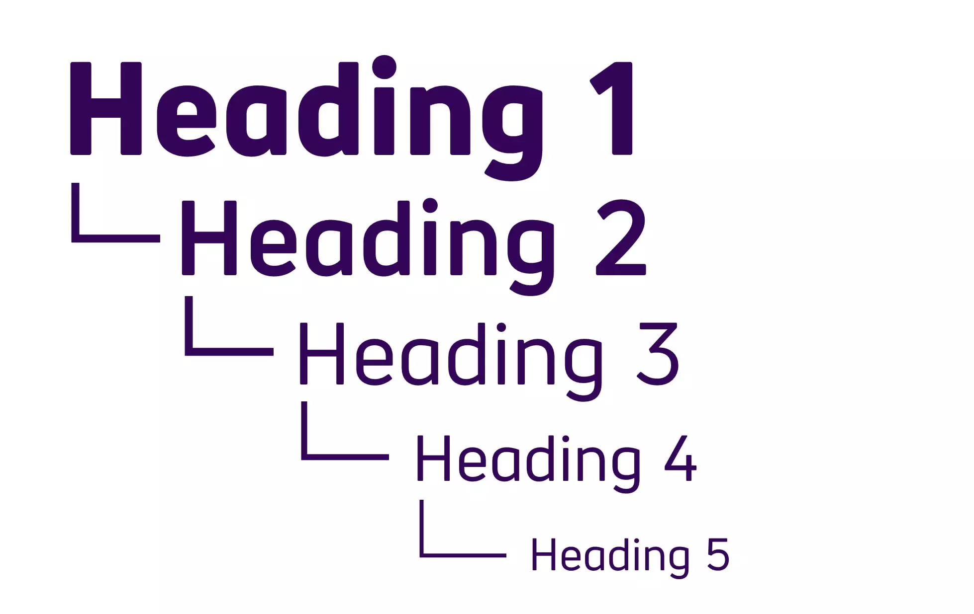
Complex, inconsistent page layouts make finding information difficult. It’s important to structure any long-form website content using H1, H2 and H3 level headings. This helps to organise the content visually, but also provides important functionality for those using assistive technology.
The more predictable and intuitive your content is, the more likely a user will find the information they need.
Essential for
- People with motor impairments who rely on assistive technology
- Screen reader users, in particular those who are blind and visually impaired
- People with learning difficulties who rely on consistent layouts for understanding
- People with cognitive impairments or fatigue
- People using screen magnification software
Useful for
- Everyone, as most people want to find the information they’re looking for quickly (poor layout and design frustrates most users).
- People who are not confident with technology
- People using mobile and tablet devices with smaller screens
6. Large links, buttons and controls

It’s important to make buttons, links and controls large enough so that people with motor impairments can use them.
Small controls, or controls that are placed too close to each other are difficult for many people to use. It’s best to not demand precision from your user and give all clickable elements space.
This is especially relevant on mobile and tablet devices with smaller screens.
Essential for
- People with motor impairments or reduced dexterity. This includes people with Cerebral Palsy and conditions like Parkinson’s and motor neurone disease.
Useful for
- Blind and visually impaired users
- Elderly people
- People using mobile and tablet devices with smaller screens
- People who are not confident with technology
- People who have lost or misplaced their glasses
These are just a few examples of web accessibility that benefit a variety of users. In fact, everyone benefits from accessibility at some point in their lives.
The more we design with accessibility in mind, the better the results for everybody.
To understand if your website or app is accessible, why not look at our accessibility audits? We can tell you how to improve the online experience of your disabled customers.